Walgreens
My role: Lead UI/UX Copywriter
Collaborators
Lead Designer: Prajakta Kadam
Copy Director: Matthew Schreiner
Art Director: Akemi Hong
Cross-functional partners: Colorectal Cancer Alliance stakeholders, Product Owner, UX Manager, Engineering Team, Spanish Translation
Tools: Figma, Microsoft Teams, Jira
Challenge: Colorectal cancer is the third most commonly diagnosed cancer in the U.S. As Walgreens Find Care serves to connect customers with in-person and online health services, we had an opportunity to spread awareness about this cancer and preventive measures.
My process:
I started by taking an audit of both the CCA website and referencing the Walgreens style guide. Ultimately, we wanted this page to feel visually like it was a collaboration between Walgreens and the CCA. The tone of voice should strike a balance between our materials (warm, compassionate, gregarious) and theirs which was more educational. I started with a copy doc that included some of our main points we wanted to include, especially educational materials.
Then, I had a brainstorming session with the lead designer to start hashing out the look and feel of the page and the heirarchy of information. Since CCA wanted to drive to a quiz on their site, we included an overview and CTA at the top of the page. We also included the red thread to make it feel like Walgreens branding.
After our initial Figma design, we gathered feedback from our copy and art director to fine tune both the wording and the visual language of the page. After the page was live, we performed A/B testing on some of the headlines and CTAs to see which performed best. We found that short and direct CTAs paired with a compassionate tone of voice received the best feedback.
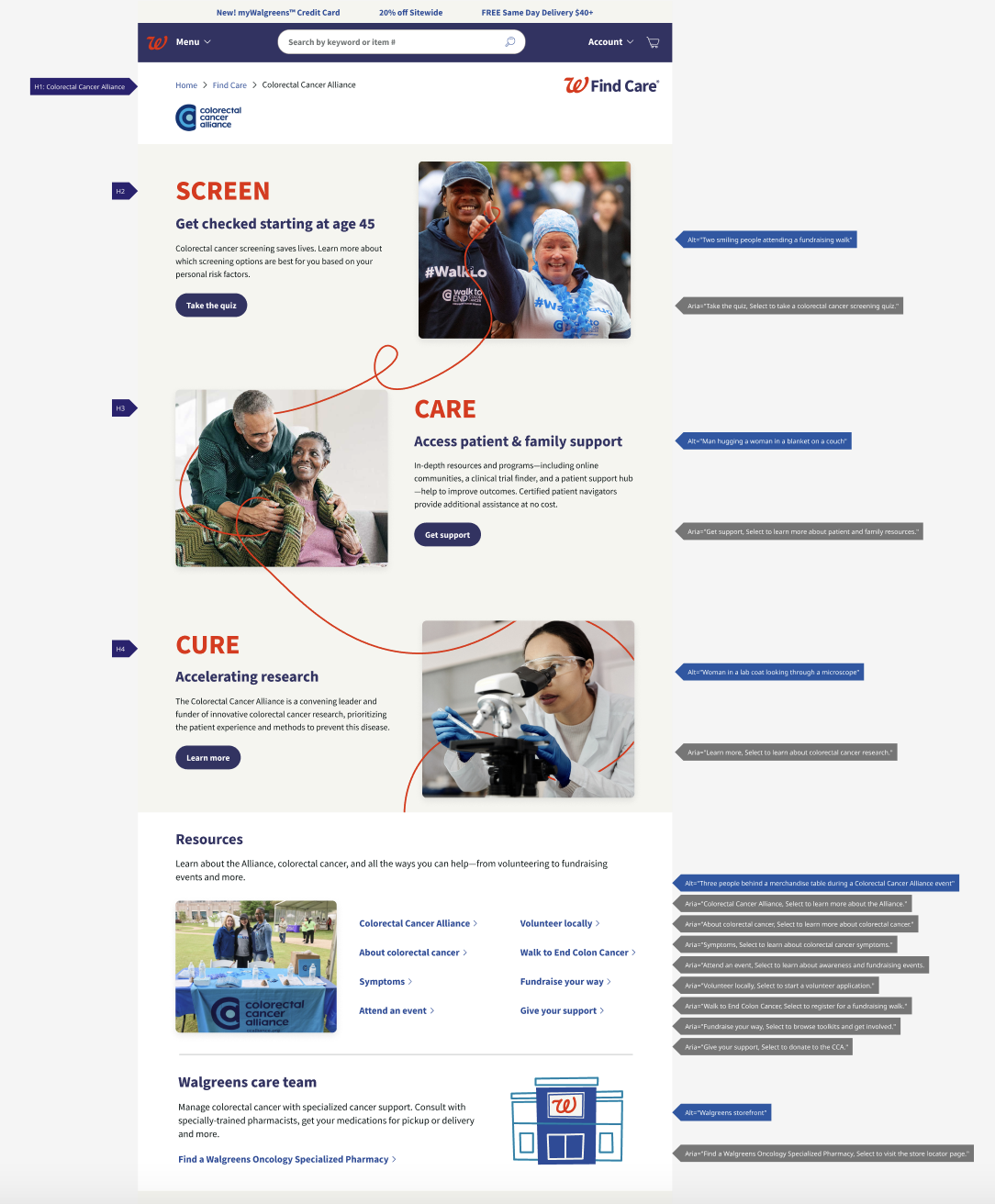
Solution: The Colorectal Cancer Alliance is a non-profit organization that provides its services nationwide and has the largest reach/broadest lifesaving impact of any colorectal cancer organization. We provided access to their screening quiz as well as educational materials, certified patient navigators, and more. Additionally, a huge initiative for our team was adding accessibility tags to ensure an optimal experience for all users on our site and app.
Results:
After launching the page, Walgreens observed:
- A 30% increase in traffic to the Colorectal Cancer Alliance page, indicating growing awareness of the topic
- Users spent 40% more time on the page, reflecting increased engagement with the content
- A/B testing favored a warm, compassionate tone of voice with short headlines and direct CTA copy
- Screening quiz submissions increased by 15%, indicating the effectiveness of clear CTAs
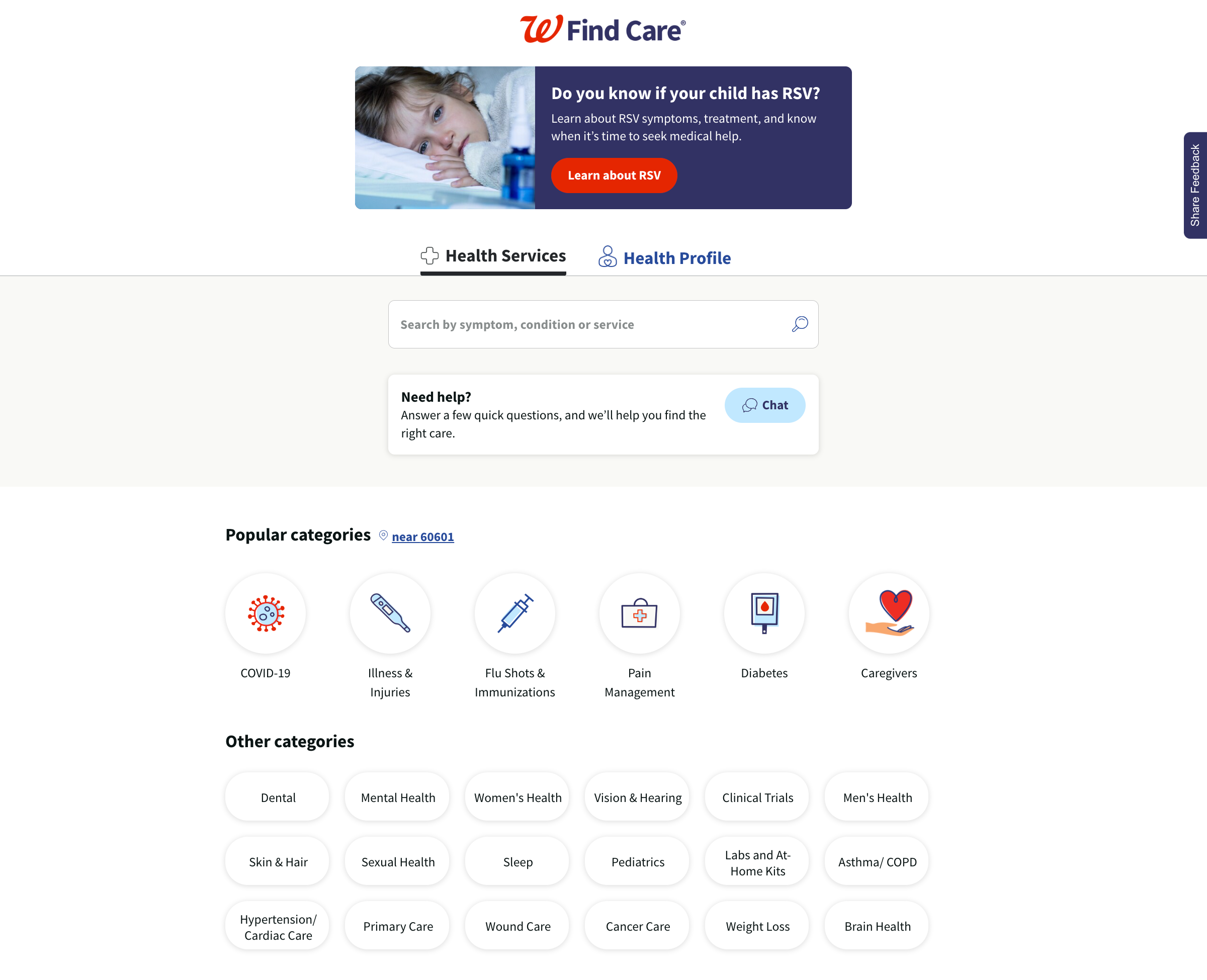
Find Care homepage

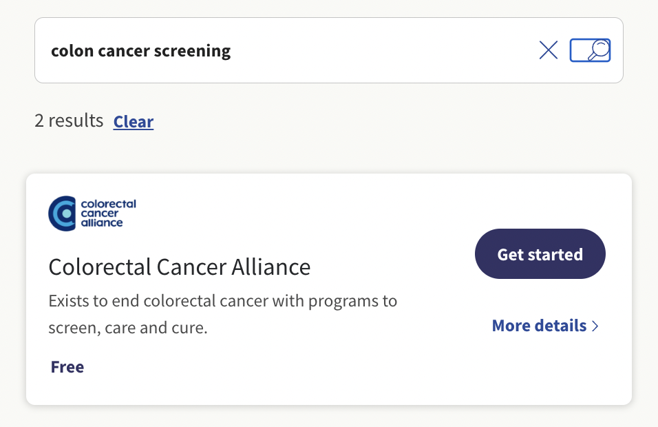
Partner tile
![]()
Partner details

Partner resource page

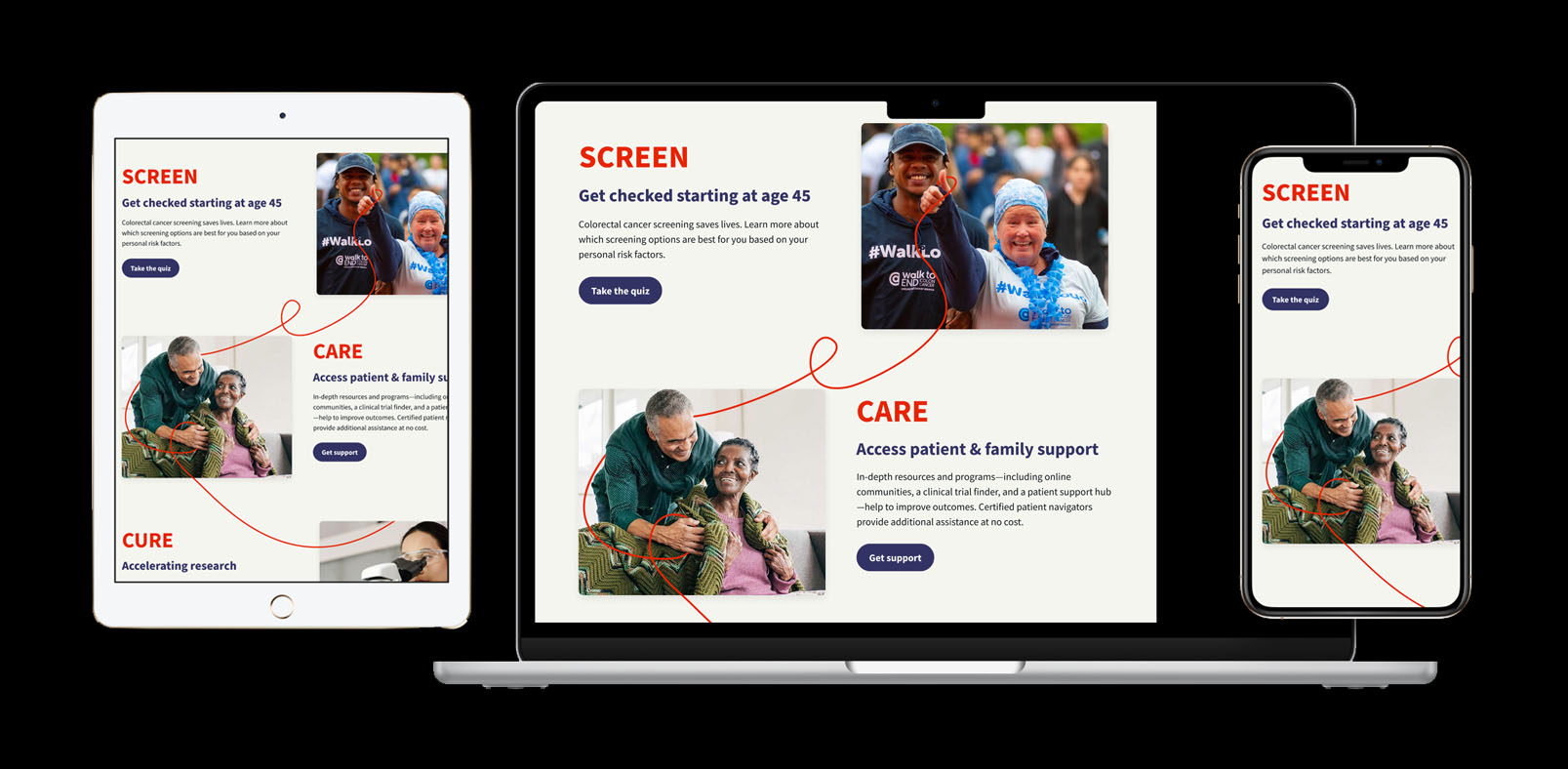
Tablet, desktop and mobile breakpoints

Accessibility tags

